'26
At the centre of the identity is the solstice itself - a symbol of balance, cycles and predictable change, rooted in Earth’s 23.5° tilt and translated into a visual language built for finance.
At the centre of the identity is the solstice itself - a symbol of balance, cycles and predictable change, rooted in Earth’s 23.5° tilt and translated into a visual language built for finance.
/ 1
The Solstice identity was built around a single unifying idea: creating a brand that could feel warm enough for accessibility, structured enough for financial trust, and distinctive enough to stand apart in the crowded DeFi landscape. The logo, colour system and visual language were all designed to express that balance.
The Solstice identity was built around a single unifying idea: creating a brand that could feel warm enough for accessibility, structured enough for financial trust, and distinctive enough to stand apart in the crowded DeFi landscape. The logo, colour system and visual language were all designed to express that balance.
/ 2
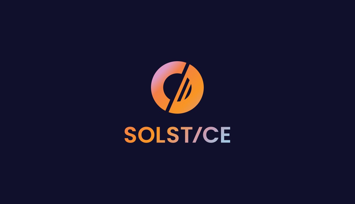
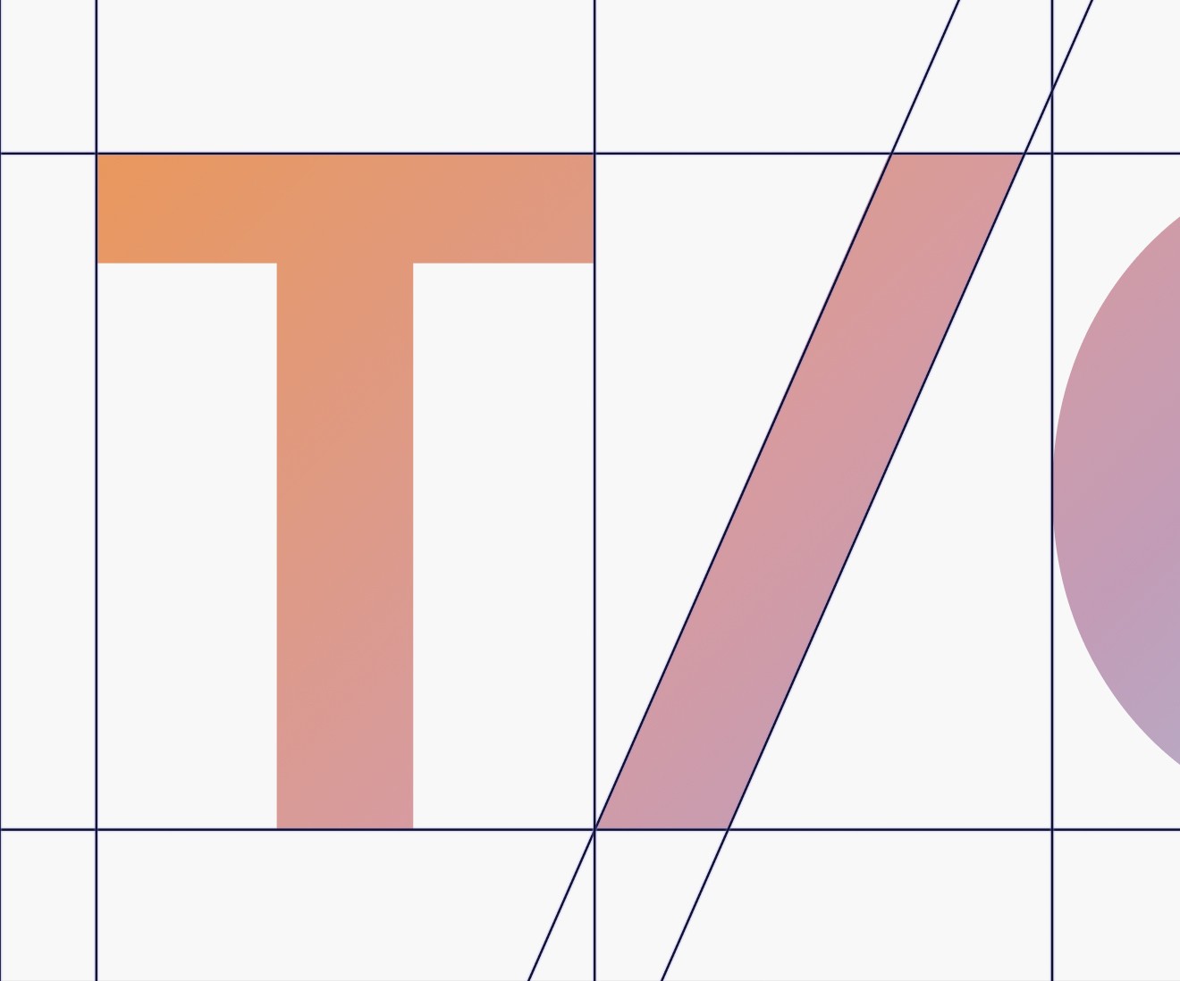
Built on a 23.5° axis inspired by the astronomical solstice, the logo system uses geometric precision, directional movement and balance to create a symbol that feels both technical and distinctive.
Built on a 23.5° axis inspired by the astronomical solstice, the logo system uses geometric precision, directional movement and balance to create a symbol that feels both technical and distinctive.

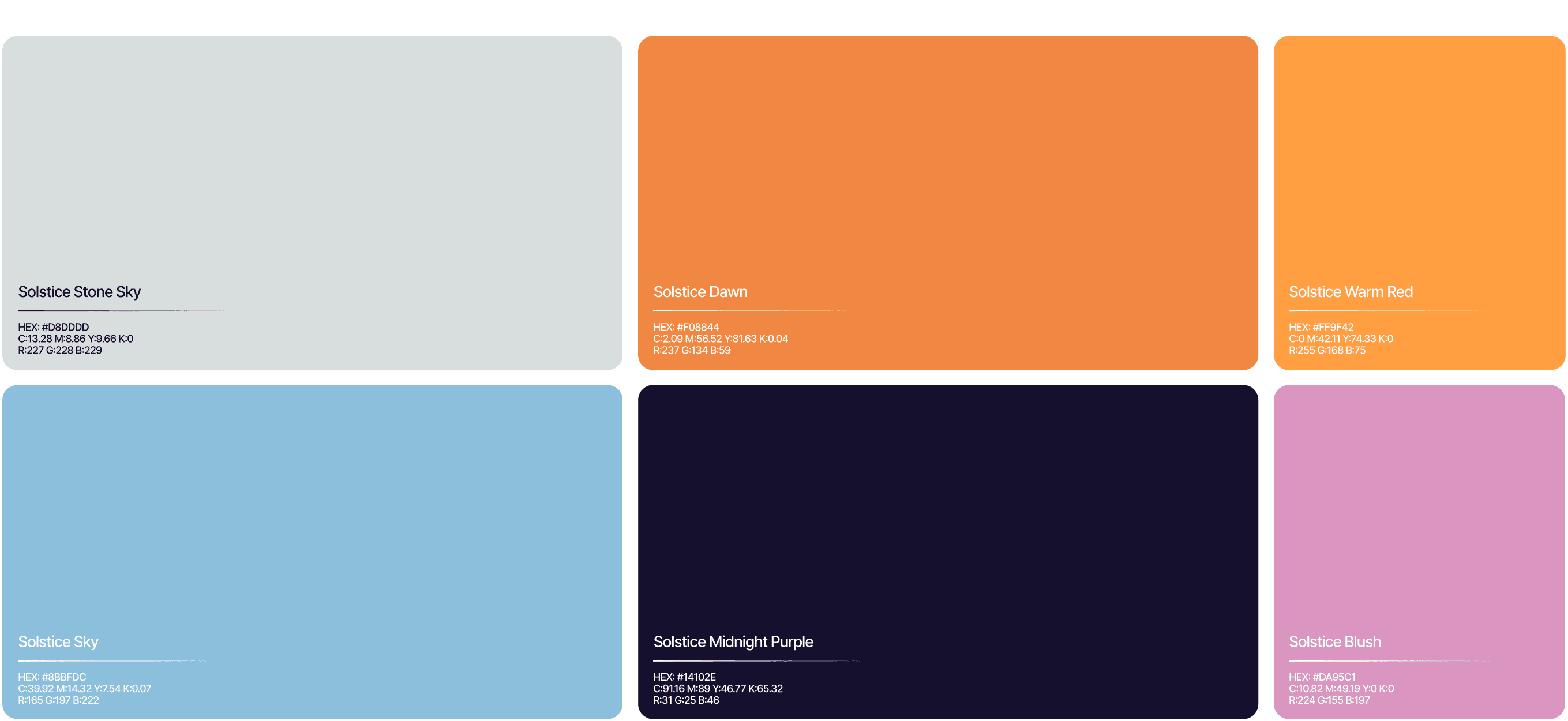
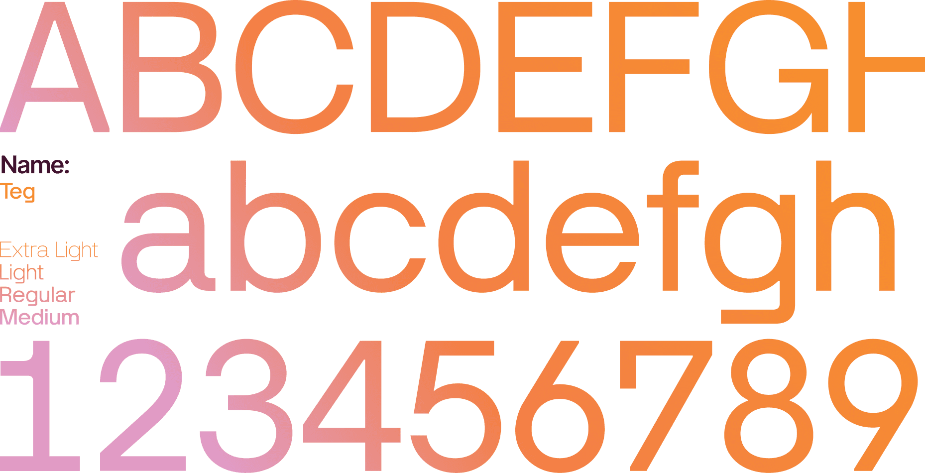
The identity system combines a dual-palette colour framework with a typographic hierarchy designed to balance warmth and precision, using expressive display type, structured body typography and contrasting visual tones to create a brand language that feels both approachable and institutionally confident.
The identity system combines a dual-palette colour framework with a typographic hierarchy designed to balance warmth and precision, using expressive display type, structured body typography and contrasting visual tones to create a brand language that feels both approachable and institutionally confident.
At the centre of the identity is the solstice itself - a symbol of balance, cycles and predictable change, rooted in Earth’s 23.5° tilt and translated into a visual language built for finance.
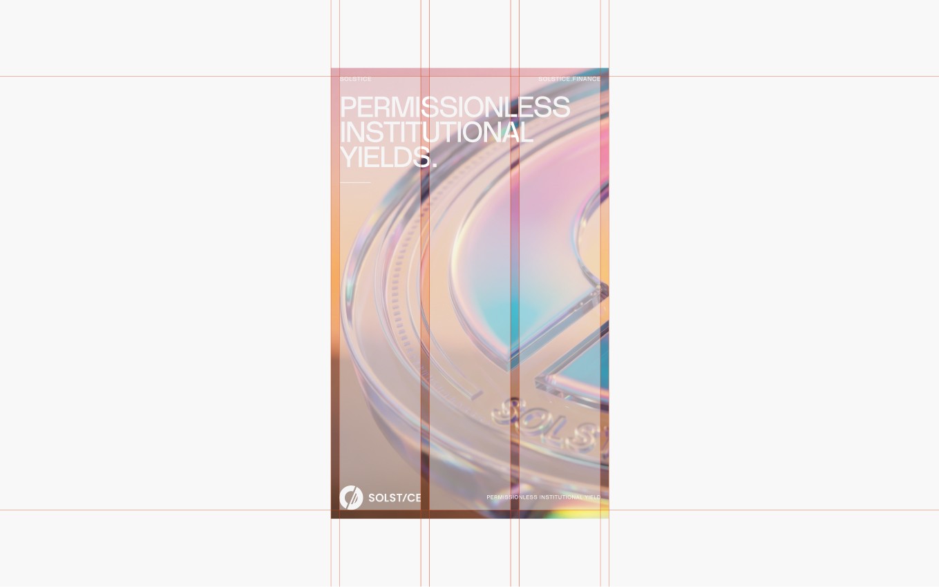
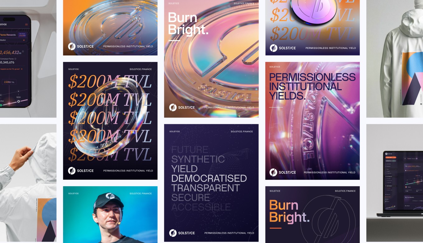
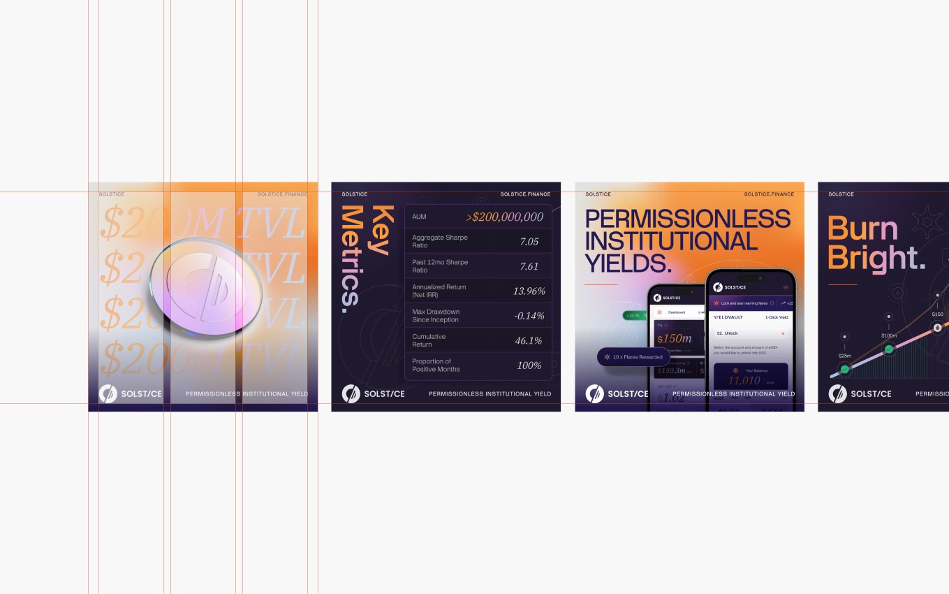
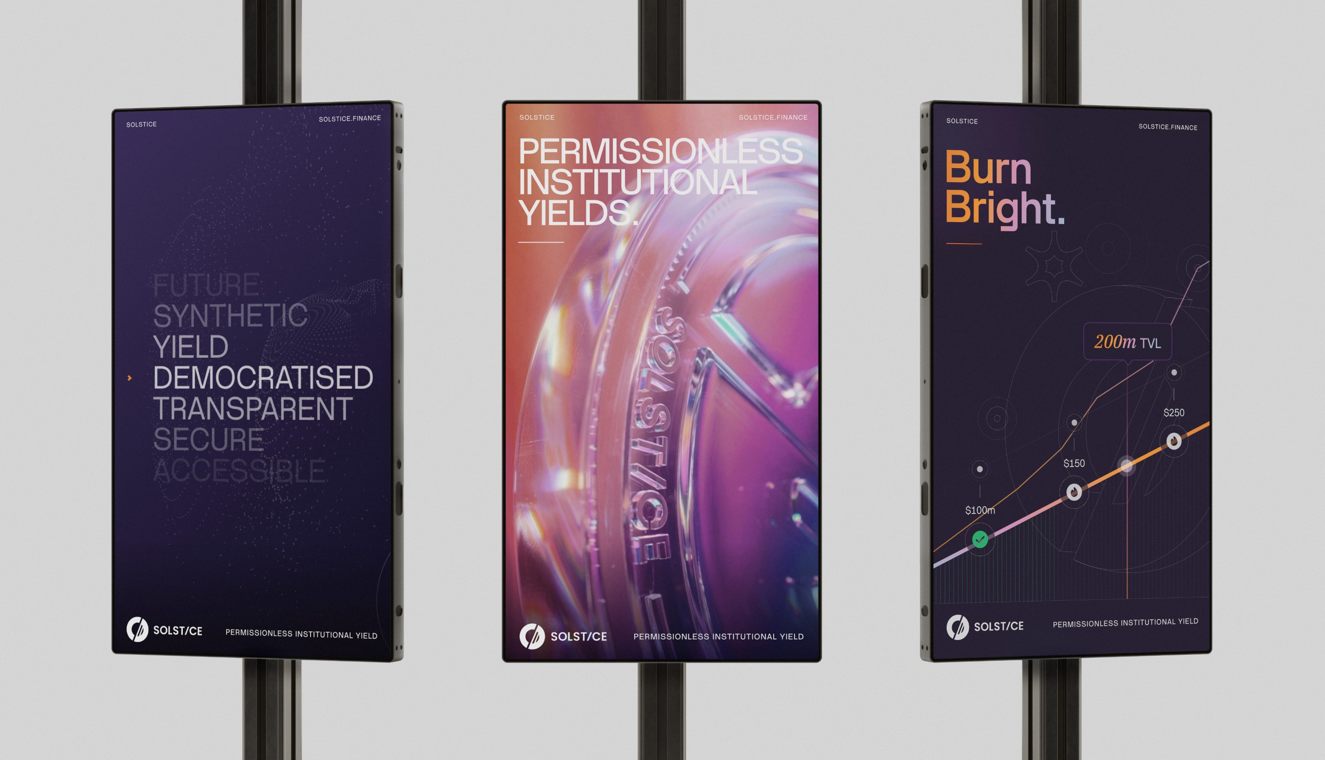
The Solstice identity was designed to scale across campaign assets, digital communications and product storytelling, creating a flexible marketing system that could carry the brand consistently across launch materials, content surfaces and high-visibility growth moments.
The Solstice identity was designed to scale across campaign assets, digital communications and product storytelling, creating a flexible marketing system that could carry the brand consistently across launch materials, content surfaces and high-visibility growth moments.
/ 3

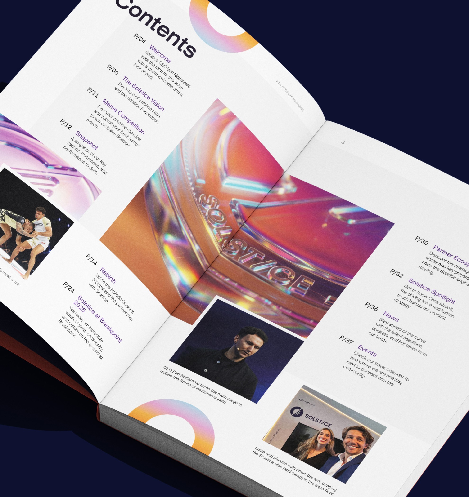

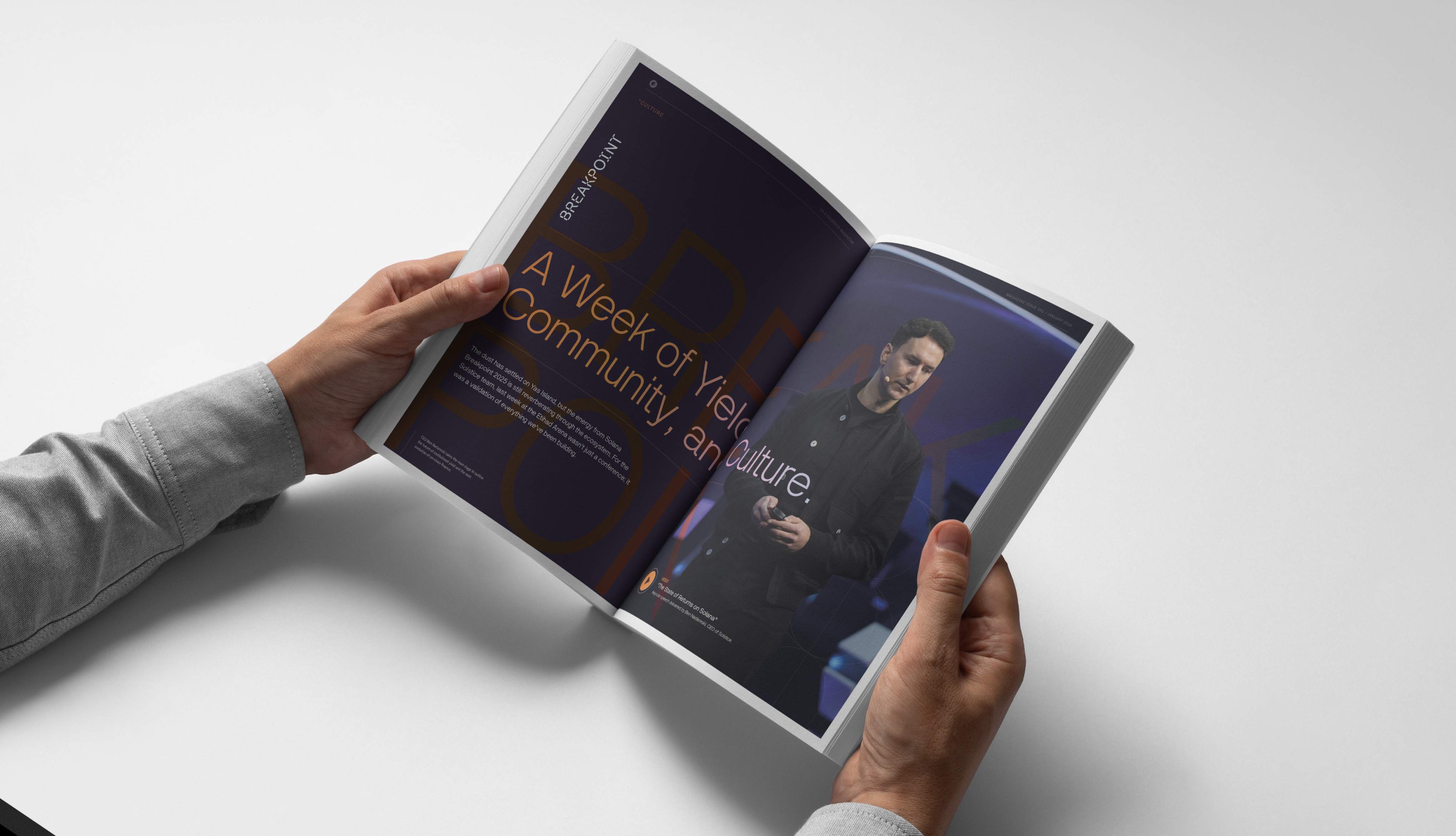
From presentation materials and brand publications to public-facing platform interfaces and product dashboards, the Solstice system was designed to create consistency across every touchpoint, translating the brand into experiences that felt clear, premium and structurally aligned across both marketing and product environments.
From presentation materials and brand publications to public-facing platform interfaces and product dashboards, the Solstice system was designed to create consistency across every touchpoint, translating the brand into experiences that felt clear, premium and structurally aligned across both marketing and product environments.
/ 4
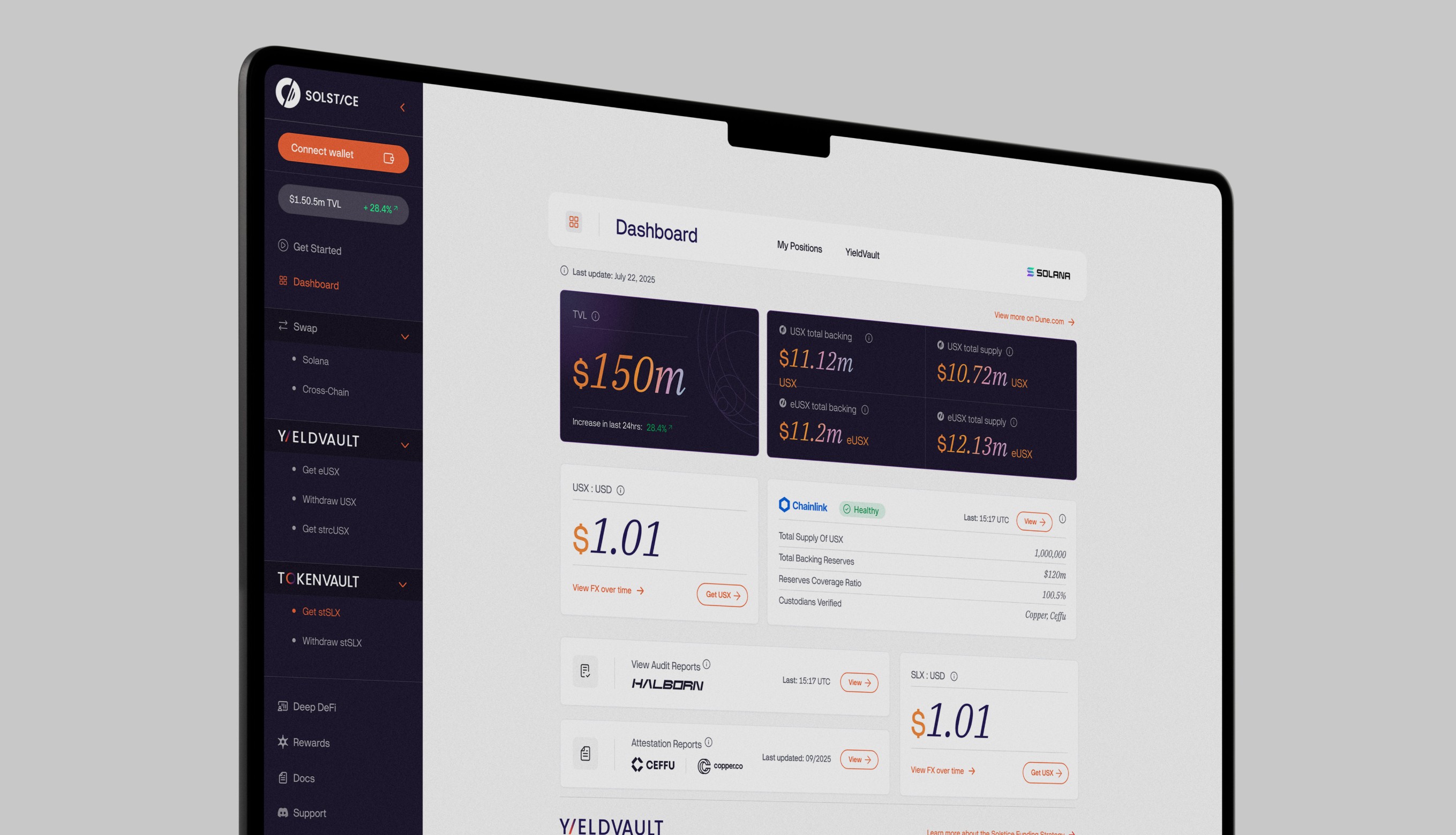
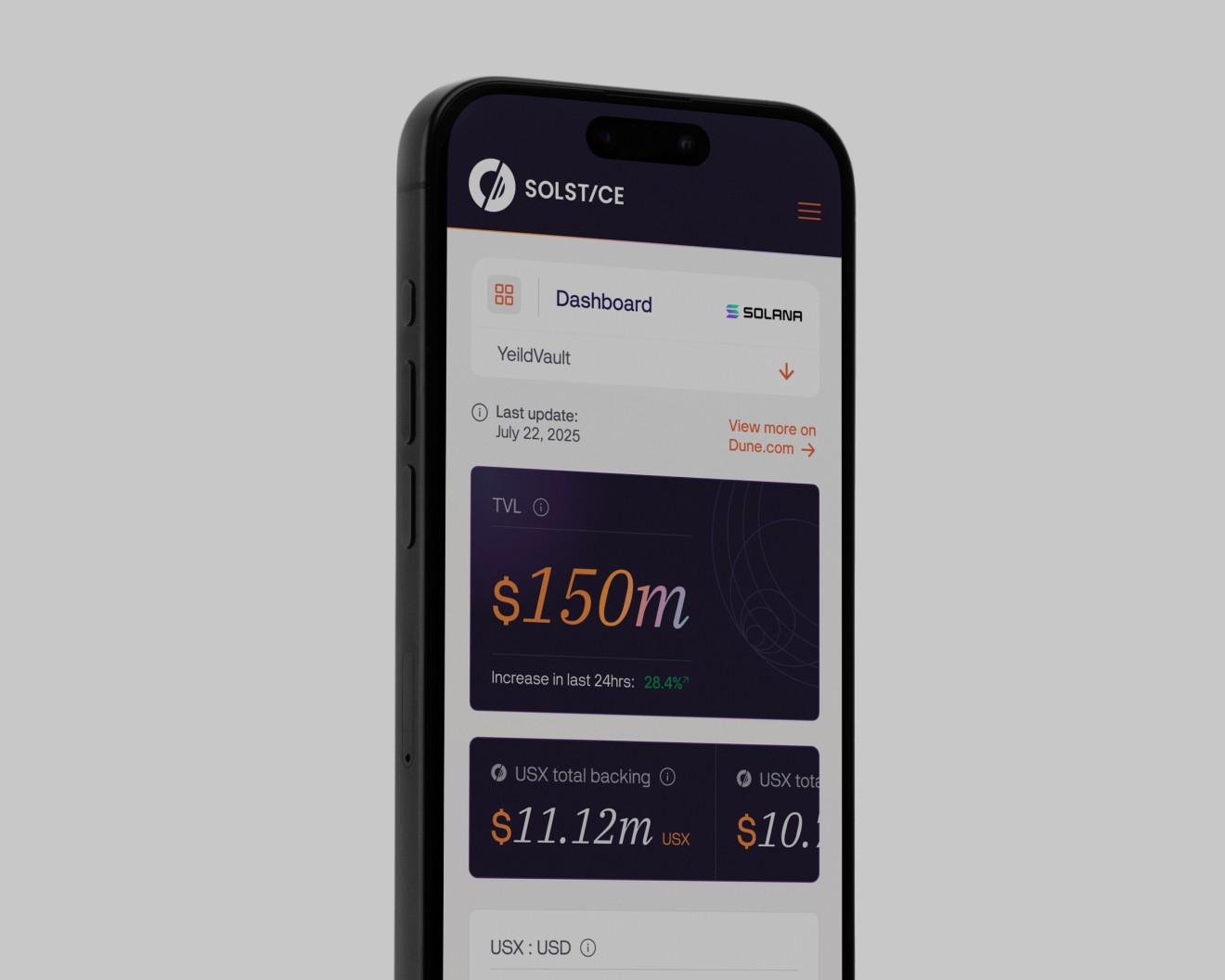
The Solstice visual system was carried into the product experience through dashboards, mobile interfaces and transactional surfaces, creating a digital environment that translated complex DeFi data into something clearer, more intuitive and visually aligned with the broader brand ecosystem.
The Solstice visual system was carried into the product experience through dashboards, mobile interfaces and transactional surfaces, creating a digital environment that translated complex DeFi data into something clearer, more intuitive and visually aligned with the broader brand ecosystem.
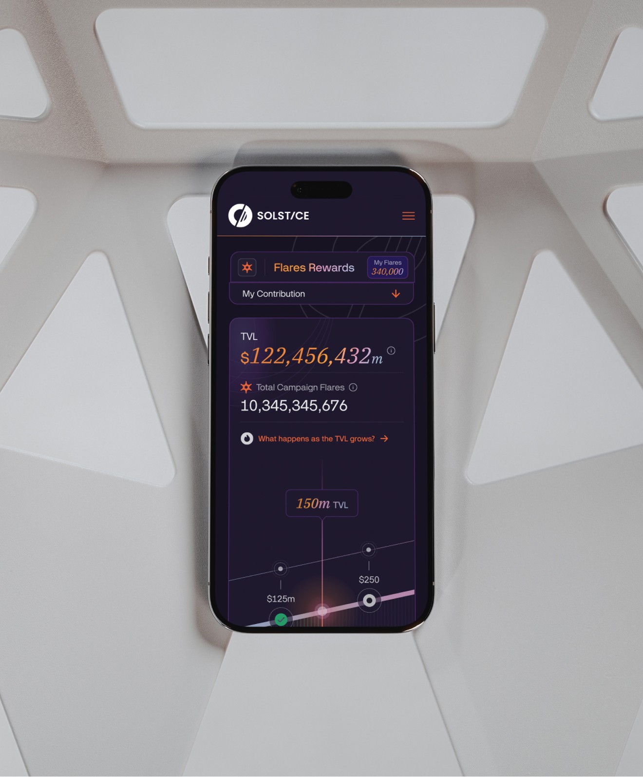
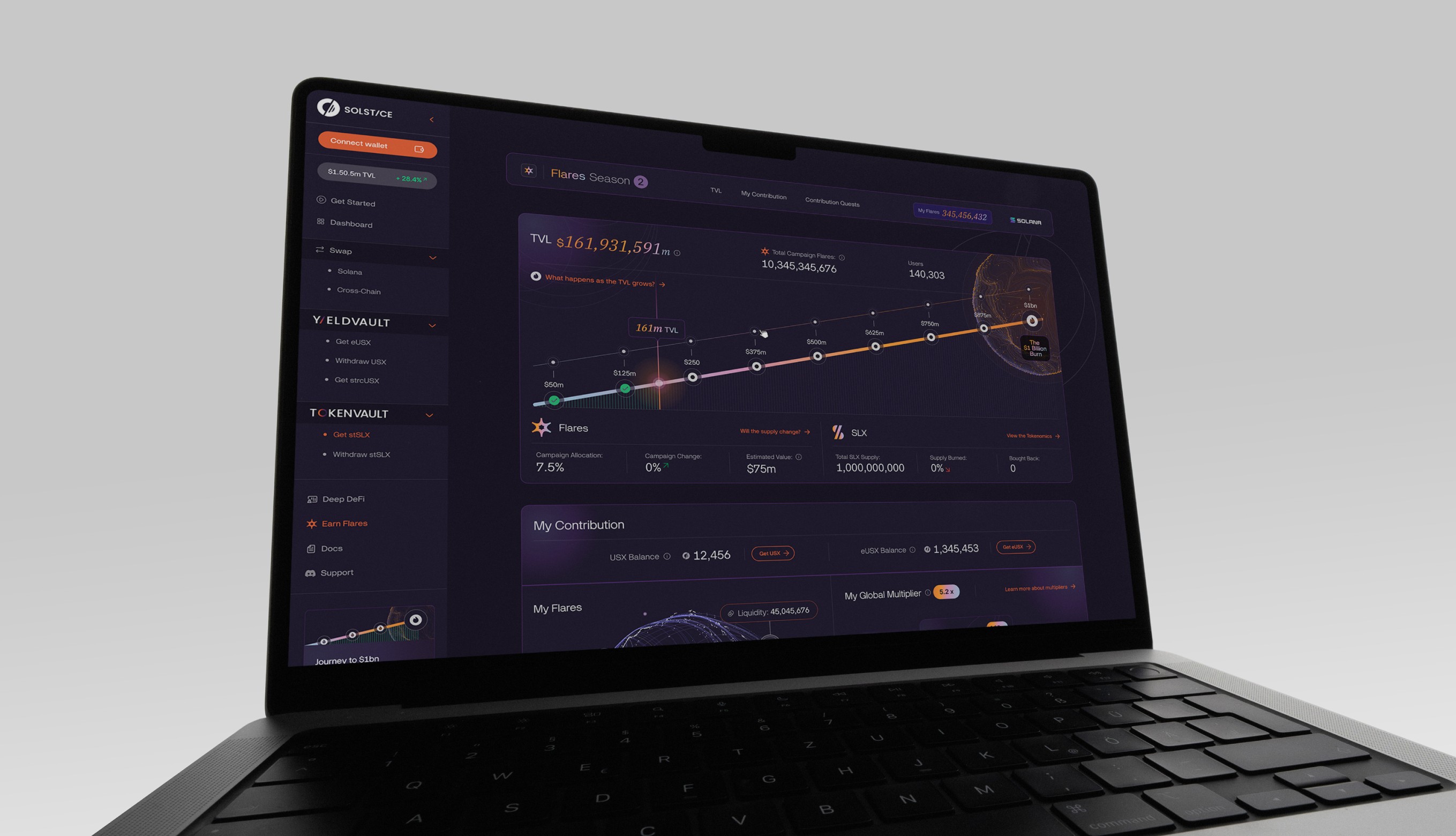
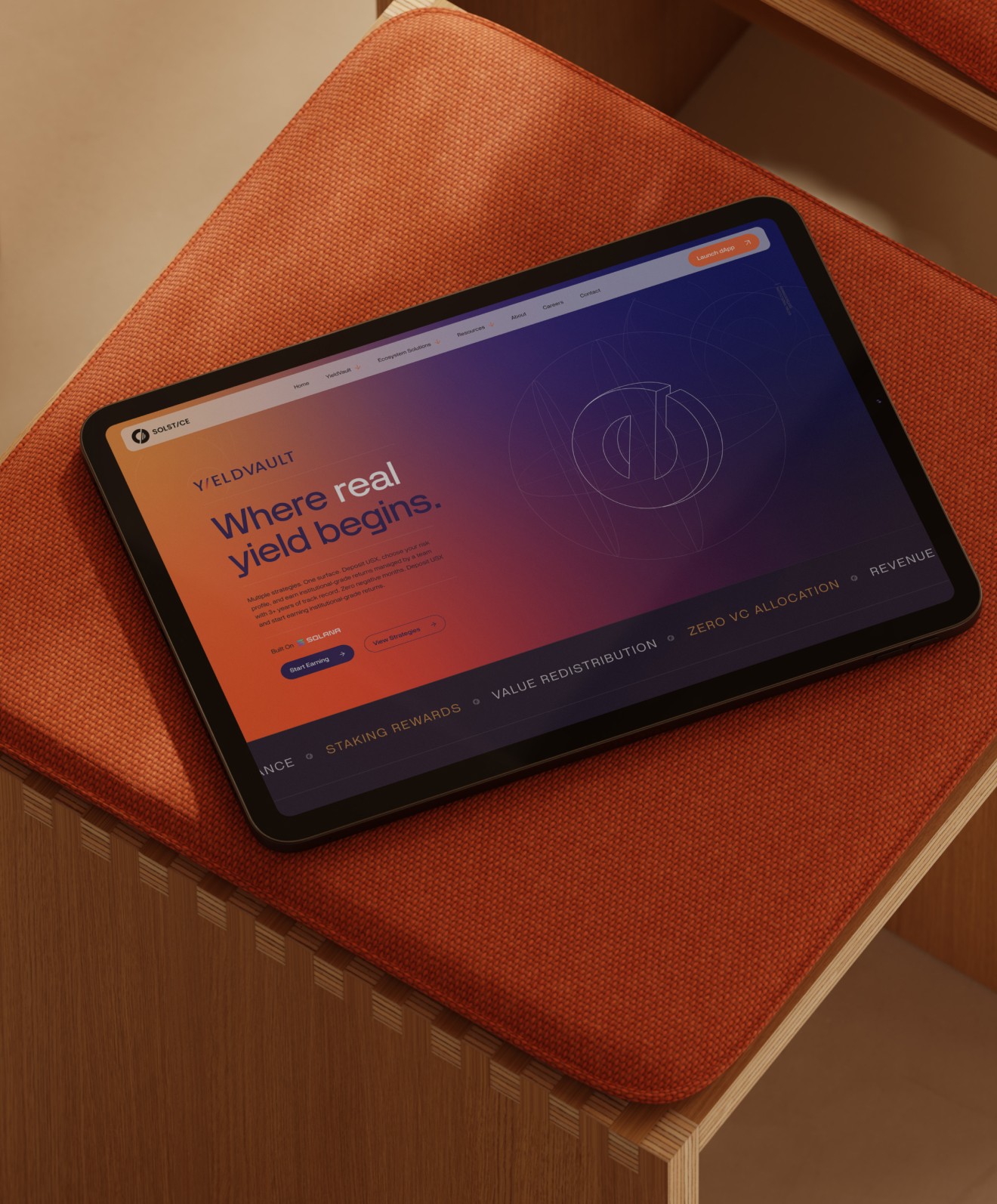
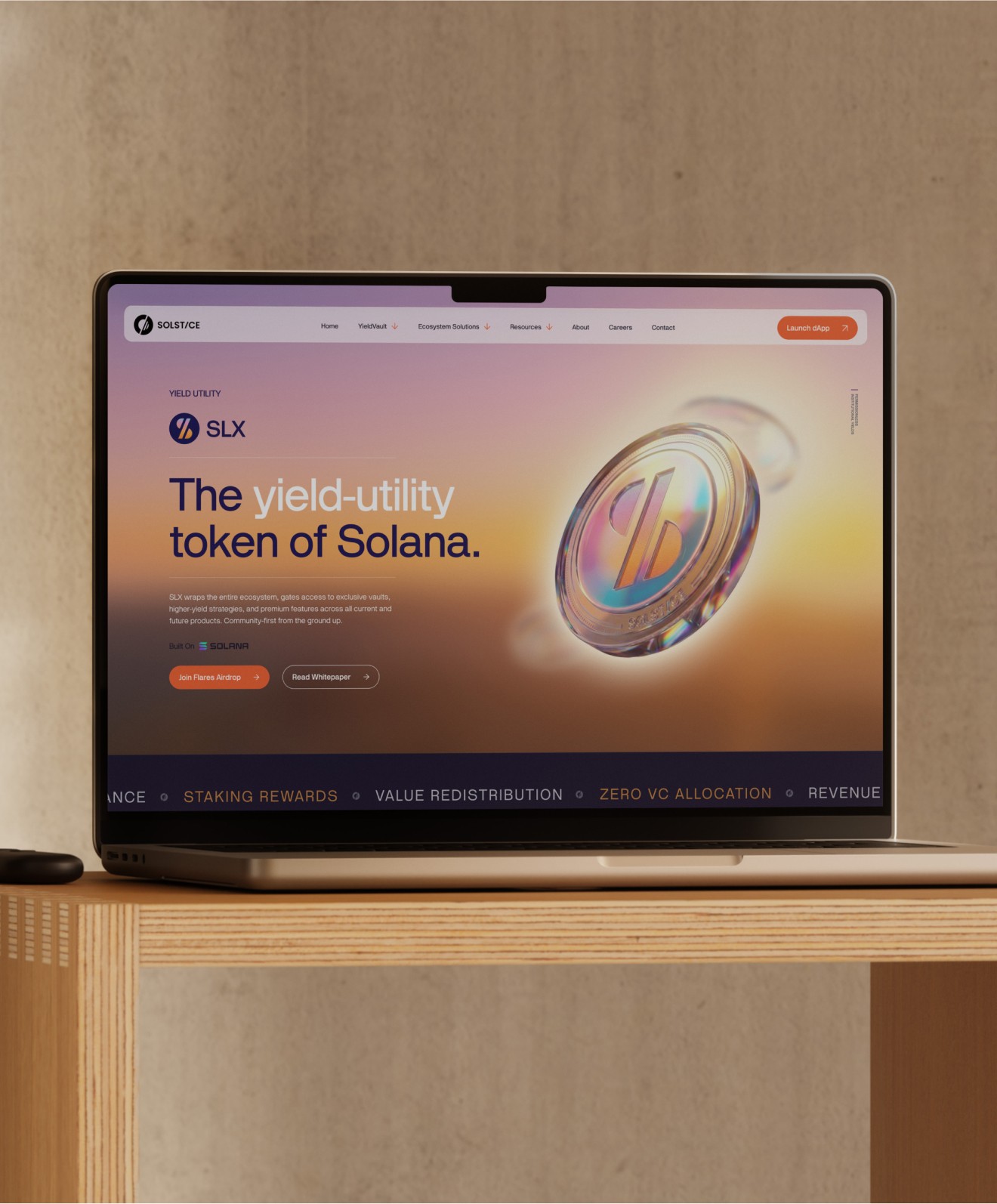
Beyond infrastructure and product design, Solstice was built as a living brand experience - extending across public websites, campaign touchpoints and community-facing moments to create a platform that felt not just functional, but culturally visible, engaging and recognisable in the real world.
/ 5

Solstice extended beyond screens and product interfaces into real-world community moments, creating a brand presence that could show up physically through events, apparel and human touchpoints - helping the platform feel more visible, relatable and culturally connected beyond DeFi itself.
Solstice extended beyond screens and product interfaces into real-world community moments, creating a brand presence that could show up physically through events, apparel and human touchpoints - helping the platform feel more visible, relatable and culturally connected beyond DeFi itself.

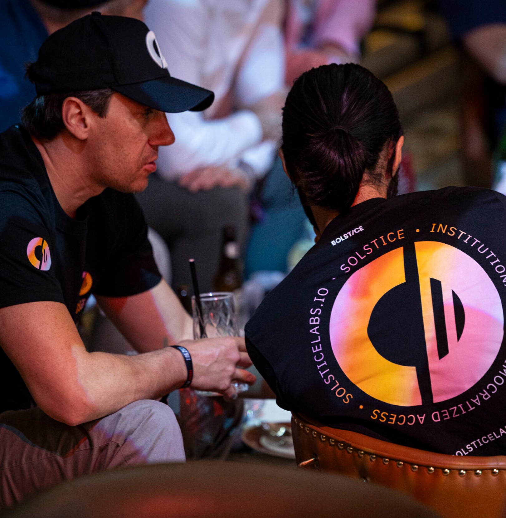
From apparel and accessories to printed collateral, packaging and branded objects, the Solstice identity was designed as a flexible system that could extend beyond screens - creating consistency across every physical touchpoint while reinforcing the brand’s premium and recognisable presence.
From apparel and accessories to printed collateral, packaging and branded objects, the Solstice identity was designed as a flexible system that could extend beyond screens - creating consistency across every physical touchpoint while reinforcing the brand’s premium and recognisable presence.
/ 6
The Solstice identity was built around a single unifying idea: creating a brand that could feel warm enough for accessibility, structured enough for financial trust, and distinctive enough to stand apart in the crowded DeFi landscape. The logo, colour system and visual language were all designed to express that balance.
The Solstice identity was built around a single unifying idea: creating a brand that could feel warm enough for accessibility, structured enough for financial trust, and distinctive enough to stand apart in the crowded DeFi landscape. The logo, colour system and visual language were all designed to express that balance.
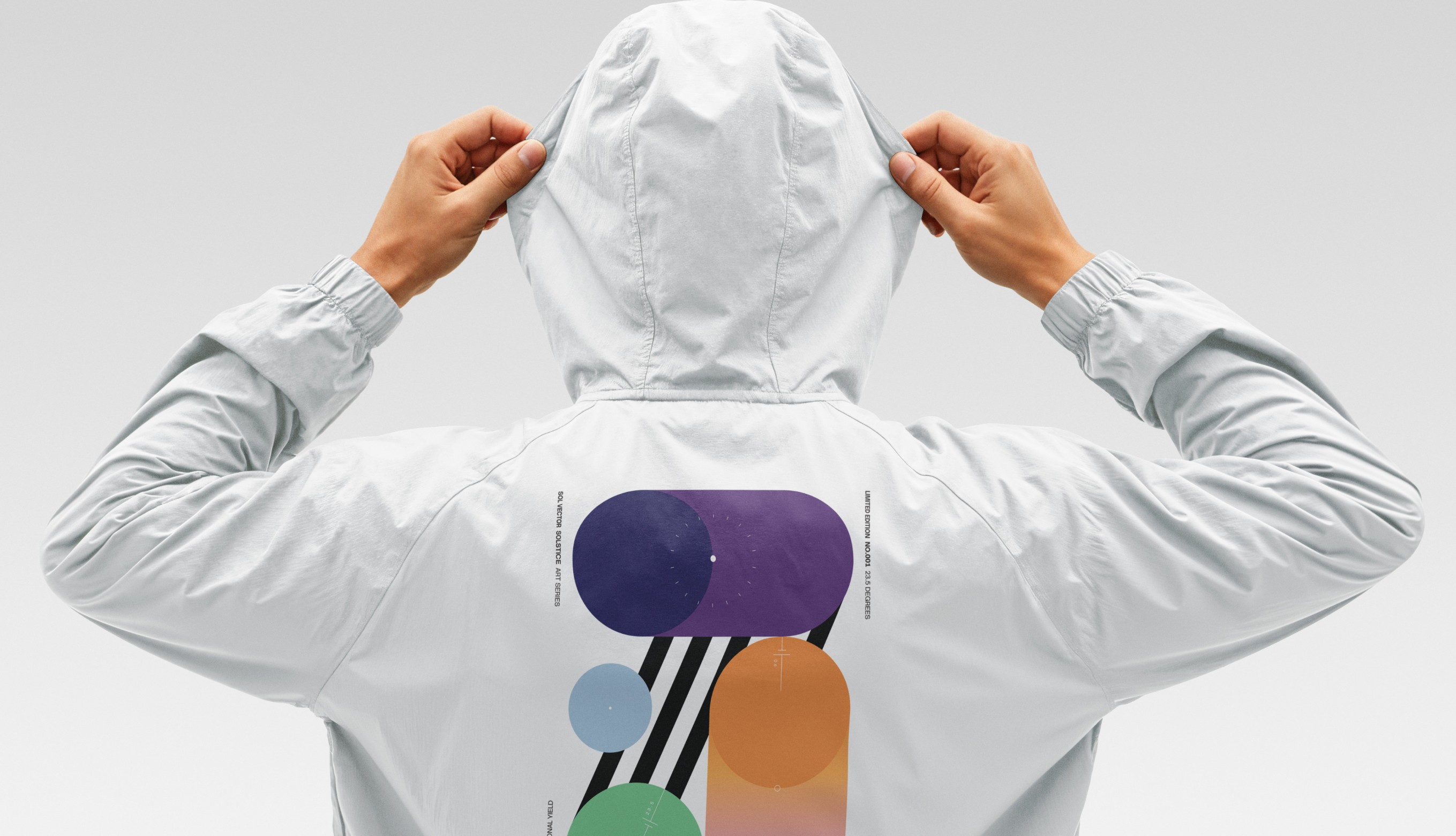
The Solstice identity was designed as a system, not just a logo - flexible enough to extend across apparel, accessories, packaging and branded objects while maintaining consistency across every physical application.
The Solstice identity was designed as a system, not just a logo - flexible enough to extend across apparel, accessories, packaging and branded objects while maintaining consistency across every physical application.
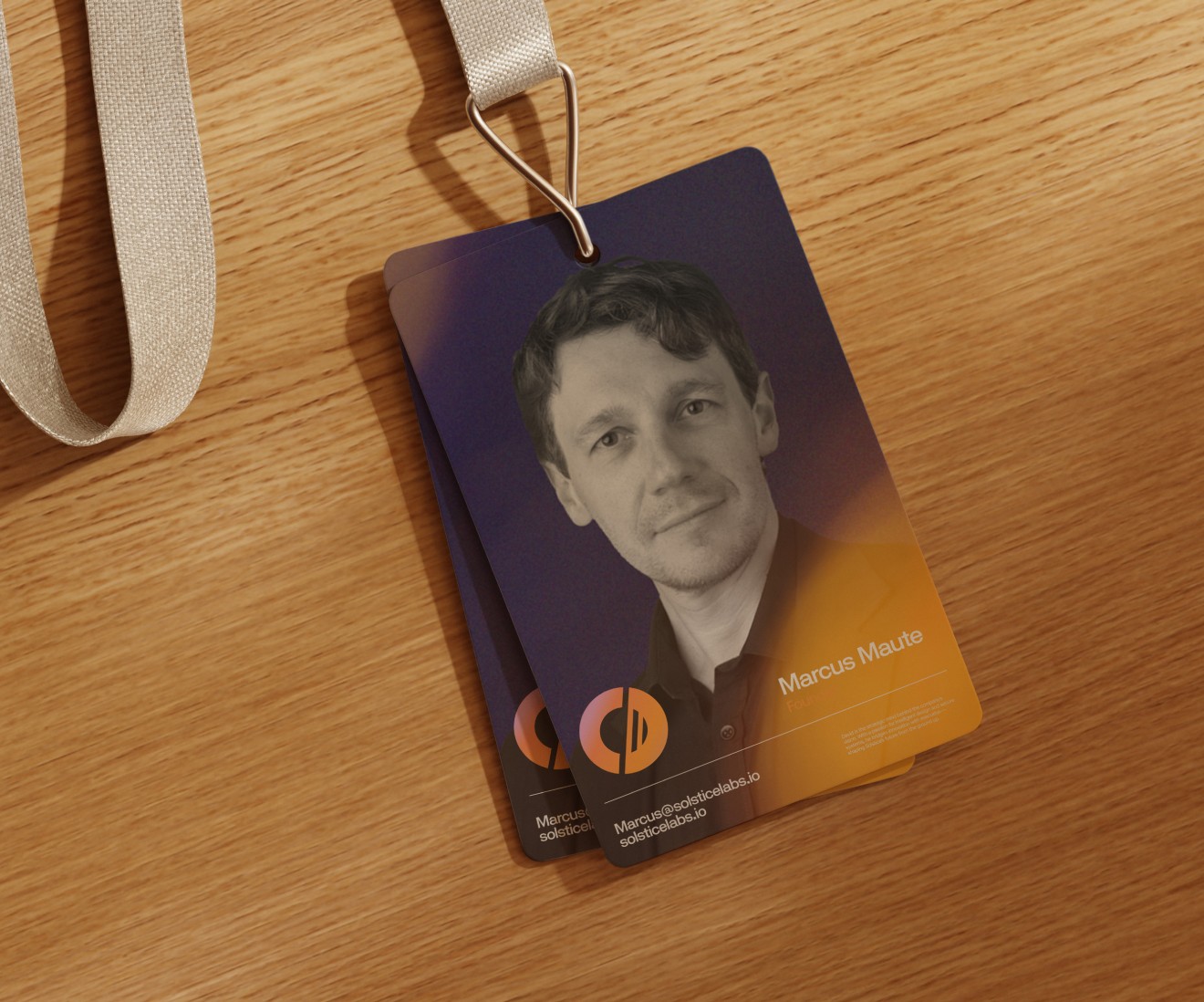

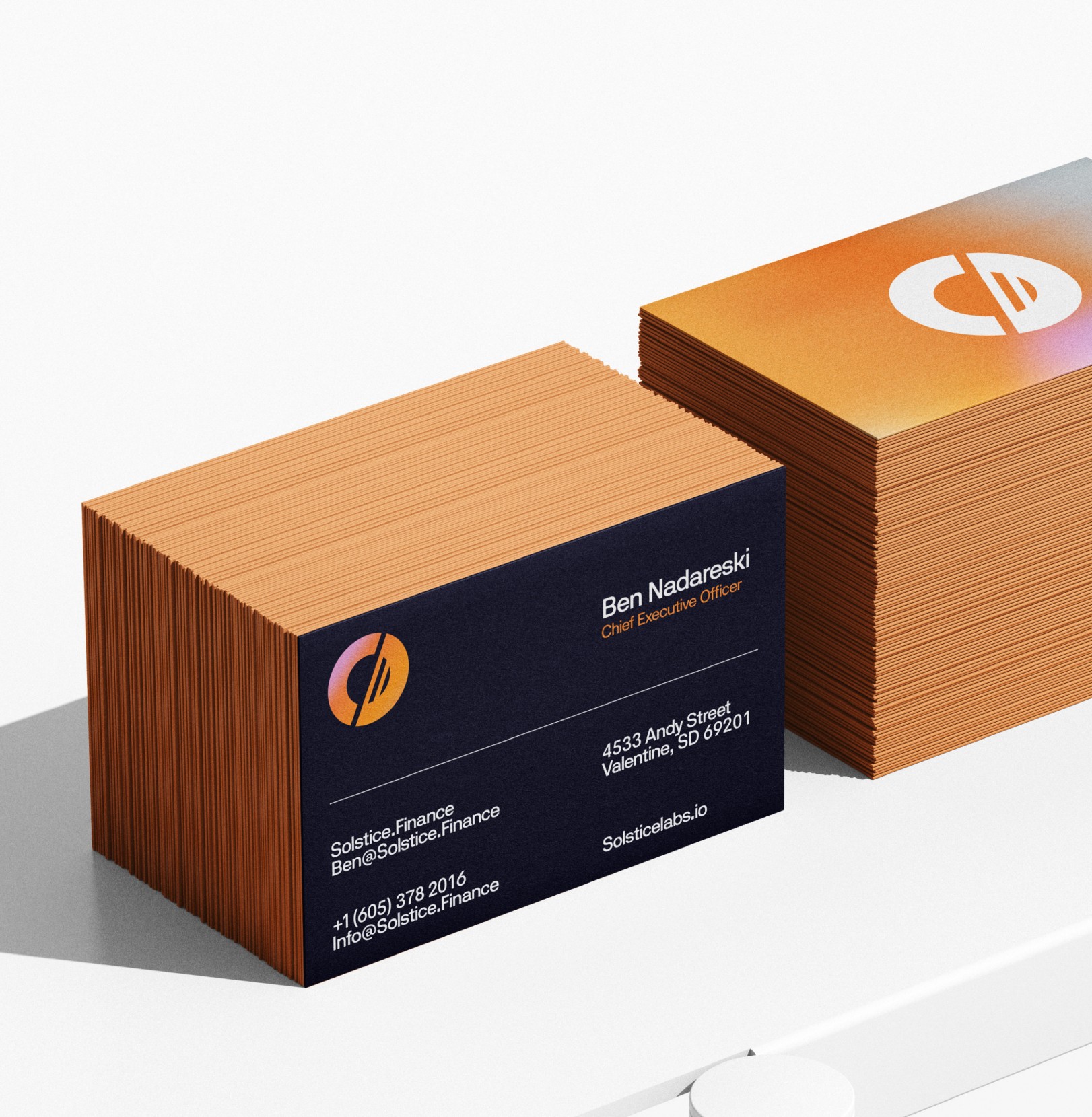
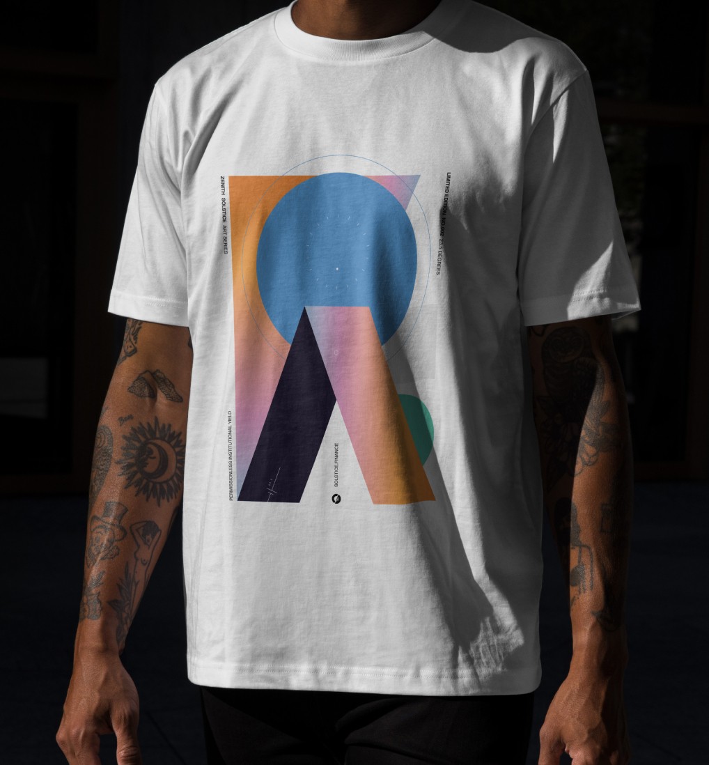
By translating the visual language into merchandise, printed collateral and lifestyle assets, the brand gained a tangible presence beyond digital finance, helping Solstice feel more recognisable, collectible and culturally visible in the real world.
By translating the visual language into merchandise, printed collateral and lifestyle assets, the brand gained a tangible presence beyond digital finance, helping Solstice feel more recognisable, collectible and culturally visible in the real world.
What began as a brand identity project became the public-facing foundation for Solstice’s broader DeFi ecosystem — translating a technically complex financial infrastructure business into a visual and digital system built for trust, clarity and long-term scale. In a category where most platforms lean too speculative for serious capital or too technical for mainstream adoption, Solstice launched with a brand designed to hold both at once: open enough for first-time wallet users, credible enough for institutional stakeholders, and distinctive enough to establish a meaningful presence in one of the fastest-moving sectors in digital finance.
By grounding the work in a clear strategic metaphor and extending it across identity, product design, marketing systems and public-facing digital experiences, Solstice gained more than a visual refresh — it gained a cohesive market-facing brand system capable of supporting launch, adoption and long-term ecosystem growth. The result was a DeFi platform with stronger positioning, clearer communication and a premium identity that helped shape how Solstice was perceived by users, partners and the broader market as it scaled from launch into one of Solana’s most visible stablecoin ecosystems.
What began as a brand identity project became the public-facing foundation for Solstice’s broader DeFi ecosystem — translating a technically complex financial infrastructure business into a visual and digital system built for trust, clarity and long-term scale. In a category where most platforms lean too speculative for serious capital or too technical for mainstream adoption, Solstice launched with a brand designed to hold both at once: open enough for first-time wallet users, credible enough for institutional stakeholders, and distinctive enough to establish a meaningful presence in one of the fastest-moving sectors in digital finance.
By grounding the work in a clear strategic metaphor and extending it across identity, product design, marketing systems and public-facing digital experiences, Solstice gained more than a visual refresh — it gained a cohesive market-facing brand system capable of supporting launch, adoption and long-term ecosystem growth. The result was a DeFi platform with stronger positioning, clearer communication and a premium identity that helped shape how Solstice was perceived by users, partners and the broader market as it scaled from launch into one of Solana’s most visible stablecoin ecosystems.
/ 7
These shifts translated into measurable improvements:
$400M+
$400M+
Total value locked
15.4K+
15.4K+
Active wallets
Top 7
Top 7
Stablecoin on Solana
30+
30+
Launch partners